
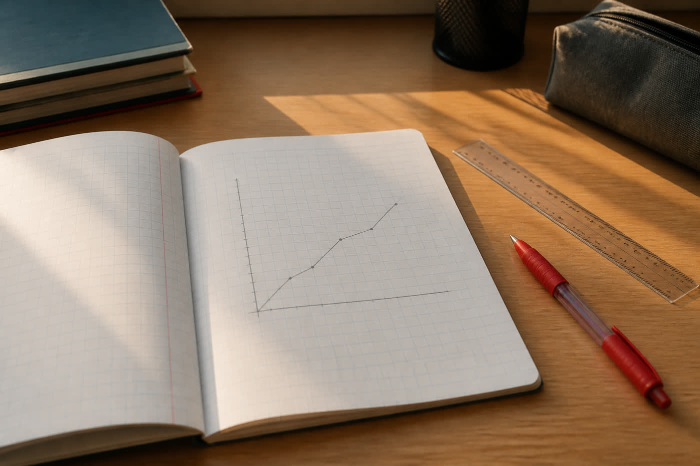
Tuesday evening, the first full week of proper IGCSE, and I spend twenty minutes staring at a line that go up and then flatten. No numbers on the side. No words along the bottom. Just a proud little mountain of ink, as if the shape itself is the answer.
Our Maths teacher say a graph without labels is a picture. I write that down more carefully than the rest of the notes, because it is also a Business sentence. Last month I keep reading headlines about inflation and interest rates, and half of them show a line going up. The line is not the news. The axis is the news. Up compared with last month is not the same as up compared with last year, and neither of them tell you whether a family can buy the same bread.
In ESL we are practising being precise. Not fancier. Precise. I used to think that mean longer words. It mean the difference between “prices rose” and “prices rose for the things we actually buy.” A missing label is a missing word. You can still see a direction, and you can still be wrong about what moved.
I redraw the homework graph and put “weeks” along the bottom and “marks out of 20” up the side. Suddenly it is my last two quizzes, not a mountain. The flat part is me getting comfortable, which is a polite way to say I stop being scared and also stop working as hard. That is an incentive problem hiding in a picture. If nobody name the axes, you can admire the shape and miss the story.
Finance, later, will be full of graphs that want to look finished. I want to keep the habit of asking what the silent side is measuring. A beautiful line with no units is like a song with no time signature. You can hum it. You cannot play it with anyone else.
The worksheet is done. The mountain have words now. I feel slightly less proud of the drawing and much more sure of the point, which is probably the first week going to plan.